
Mistakes When Choosing Kitchen Worktop Colours
Common mistakes and how to avoid them - when choosing kitchen worktops:
Choosing a kitchen worktop colour isn’t just about what looks good on a sample. It has a direct impact on how a space feels, functions, and performs over time. Get it wrong, and even a well-designed kitchen can feel smaller, darker, or visually unbalanced.
The good news is that most issues come down to a few common mistakes. Here’s what to watch out for and how to avoid the mistakes, when specifying a solid surface worktop.
1. Not Considering Lighting Conditions
A colour that looks perfect in a showroom can behave very differently once installed. Lighting (both natural and artificial) plays a huge role in how a surface looks.
Dark colours absorb light, which can flatten their appearance in poorly lit spaces
Lighter tones can look overly stark under cool LEDs
Subtle undertones (warm vs cool) shift depending on light temperature
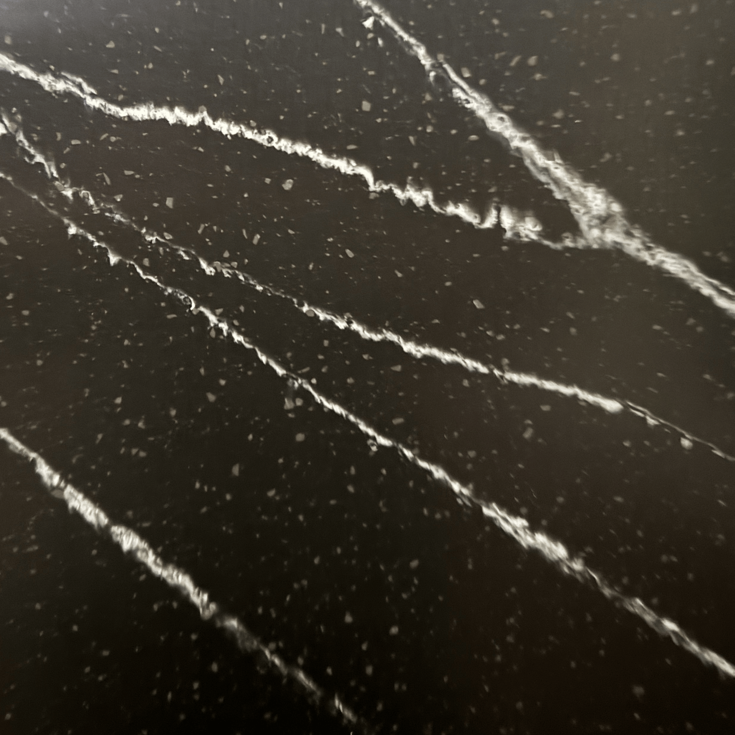
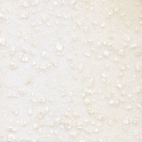
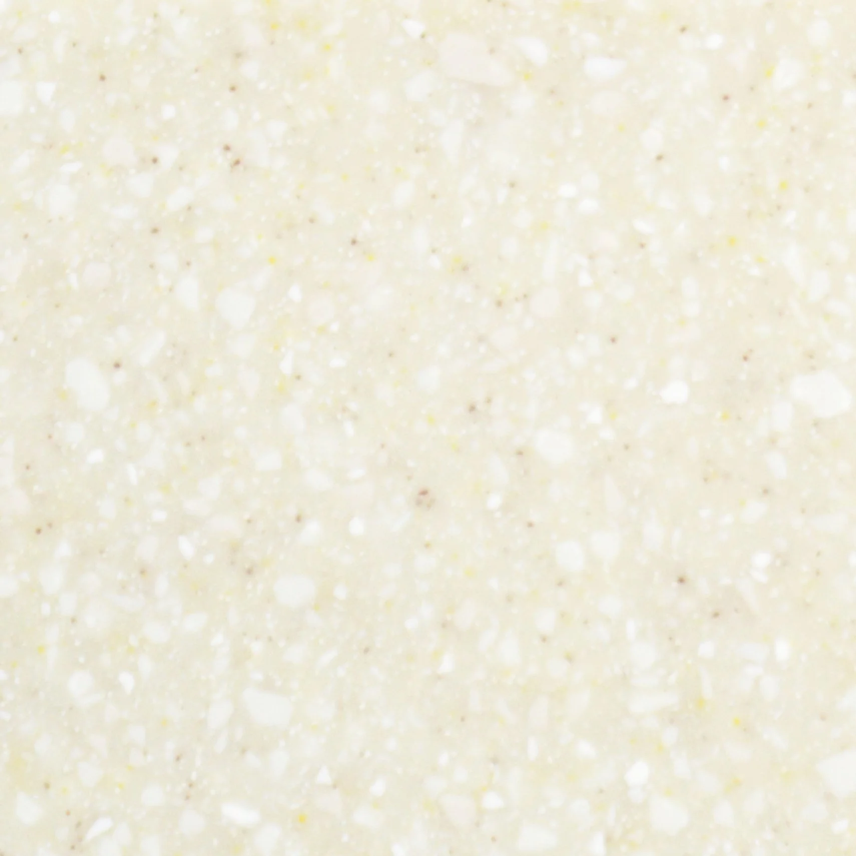
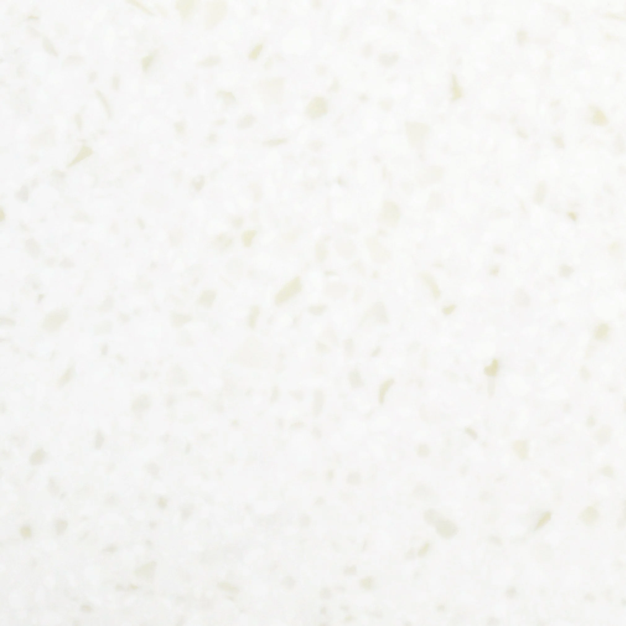
Example - What Tristone Gold Twilight solid surface looks like in different lightings (natural light / artificial light):
What to do instead: Always assess samples in the actual environment. Ideally, view them at different times of day and under the intended lighting setup.
2. Going Too Dark in Compact Spaces
Dark worktops can be striking, but they need to be used carefully, especially in smaller kitchens.
Because darker surfaces absorb light, they can visually reduce the sense of space if not balanced correctly.
What to do instead:
Use lighter colours as the main work surface in smaller kitchens
Introduce darker tones through features like islands or accent areas
Balance with lighter cabinetry, walls, or splashbacks
Softer neutrals—such as warm beiges or off-whites within the Tristone range - help maintain brightness while still adding depth and variation
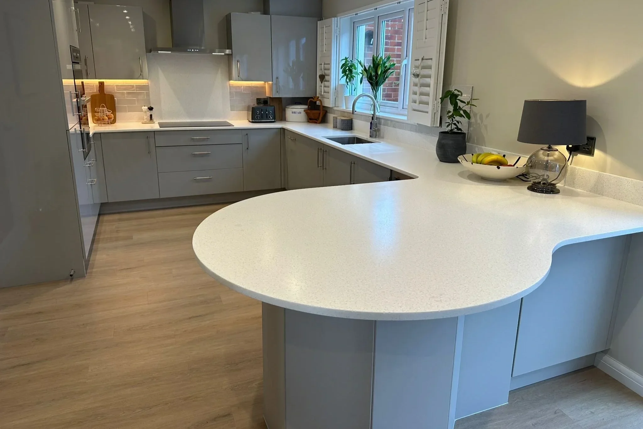
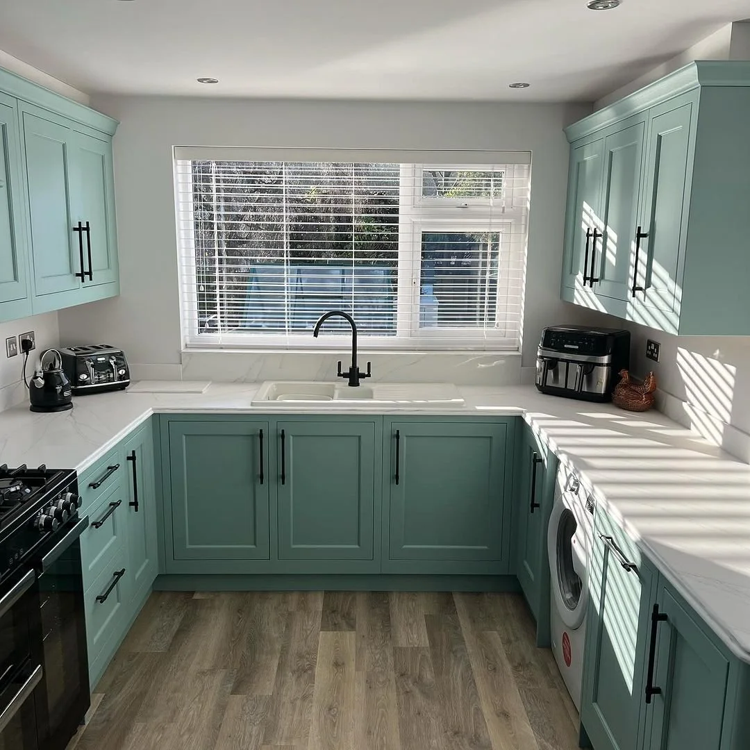
3. Overlooking the Wider Material Palette
A worktop doesn’t sit in isolation. Its colour needs to work with cabinetry, flooring, and wall finishes as part of a complete scheme.
Common issues include:
Mismatched undertones (e.g. warm worktop against cool grey units)
Excessive contrast that feels disconnected
Too little contrast, resulting in a flat, uniform look
What to do instead:
Think in layers. A well-balanced kitchen typically combines:
A primary surface (worktop)
Complementary cabinetry
A grounding element (flooring)
Supporting finishes (walls, splashbacks)
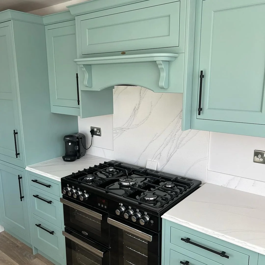
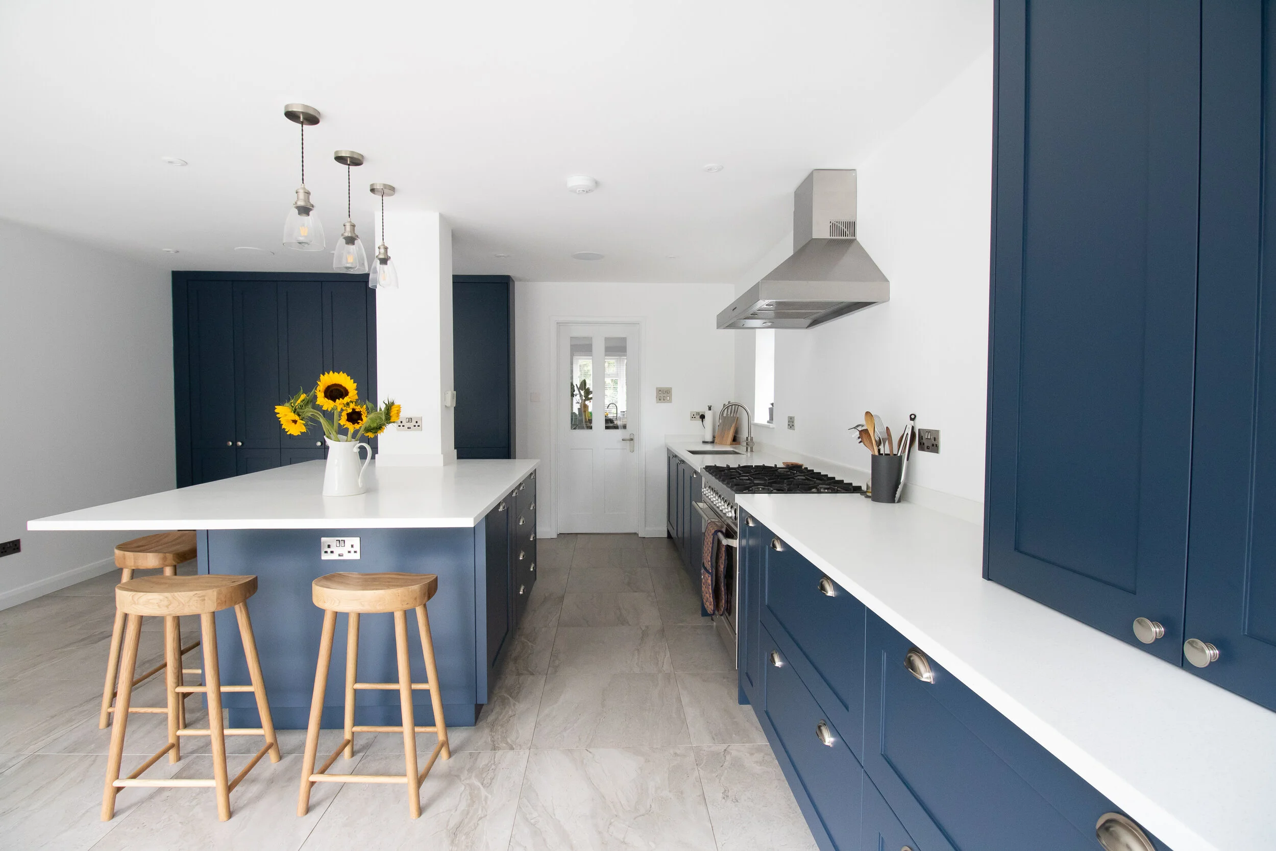
Example: Kitchen with Tristone Arezzo Solid Surface
4. Designing Around Short-Term Trends
Trends can be useful for inspiration, but they shouldn’t drive core material choices - especially for something as permanent as a worktop!
All-grey kitchens are a good example: once dominant, they’re now being replaced by warmer, more natural palettes.
What to do instead:
Choose a base colour that will remain relevant long-term
Use trends in easily changeable elements (accessories, paint, fixtures)
Focus on versatility
Tristone’s colour range is designed with this in mind, offering tones that work across both contemporary and more traditional schemes without feeling dated.
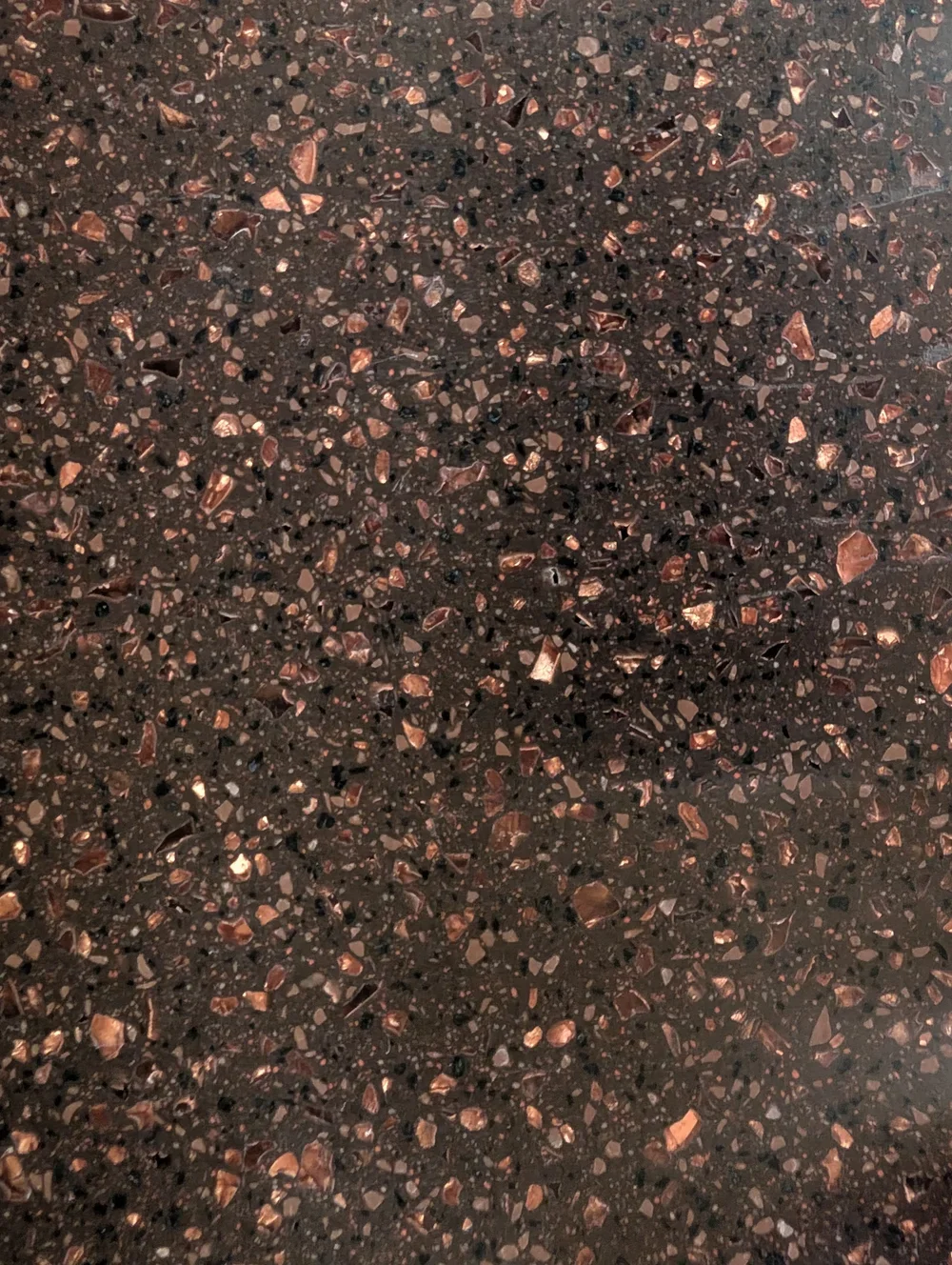
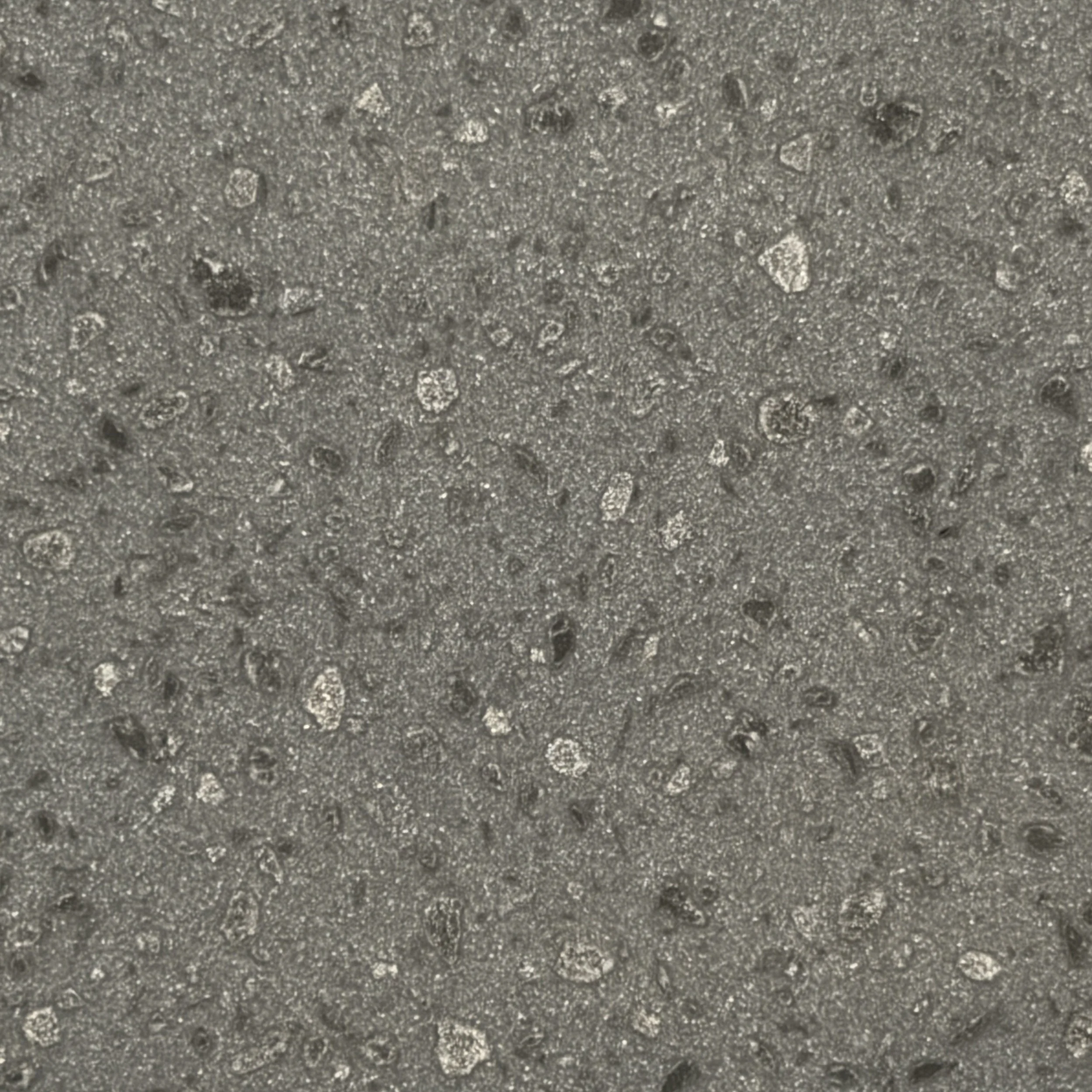
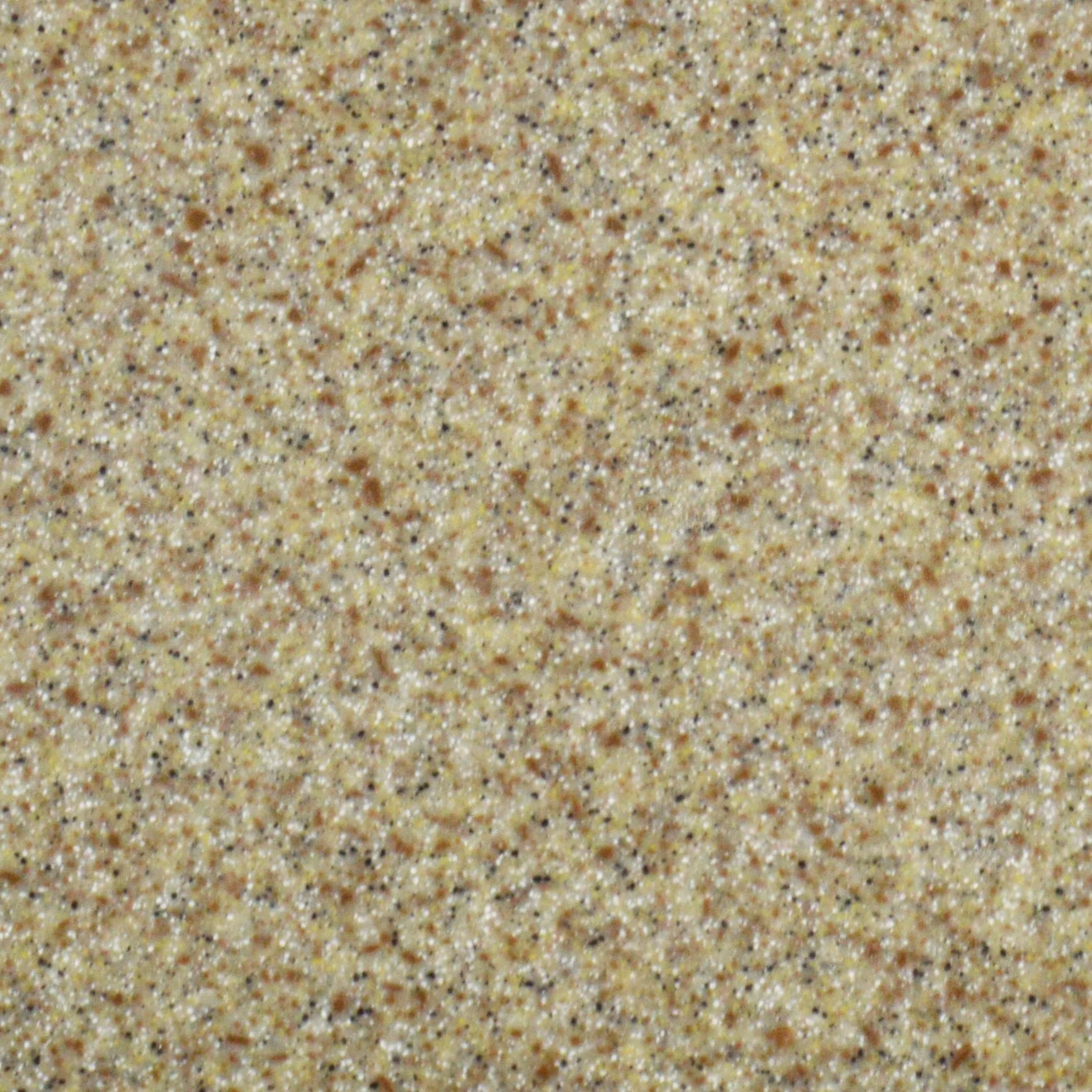
Example - some of our colours (we have 18 new ones!):


5. Focusing on Colour Over Performance
It’s easy to focus on colour and finish - but in reality, the material behind it is just as important, especially in kitchens that see daily use.
In both residential and commercial settings, worktops need to do more than look good. They need to handle moisture, heat, impact, and regular cleaning without compromising their appearance over time.
Where things often go wrong:
Choosing surfaces that require high maintenance to keep their finish
Not considering how the material reacts to stains, spills, or bacteria
Treating damage as permanent, rather than repairable
What to do instead:
Take a material-first approach, then refine your colour choice within that.
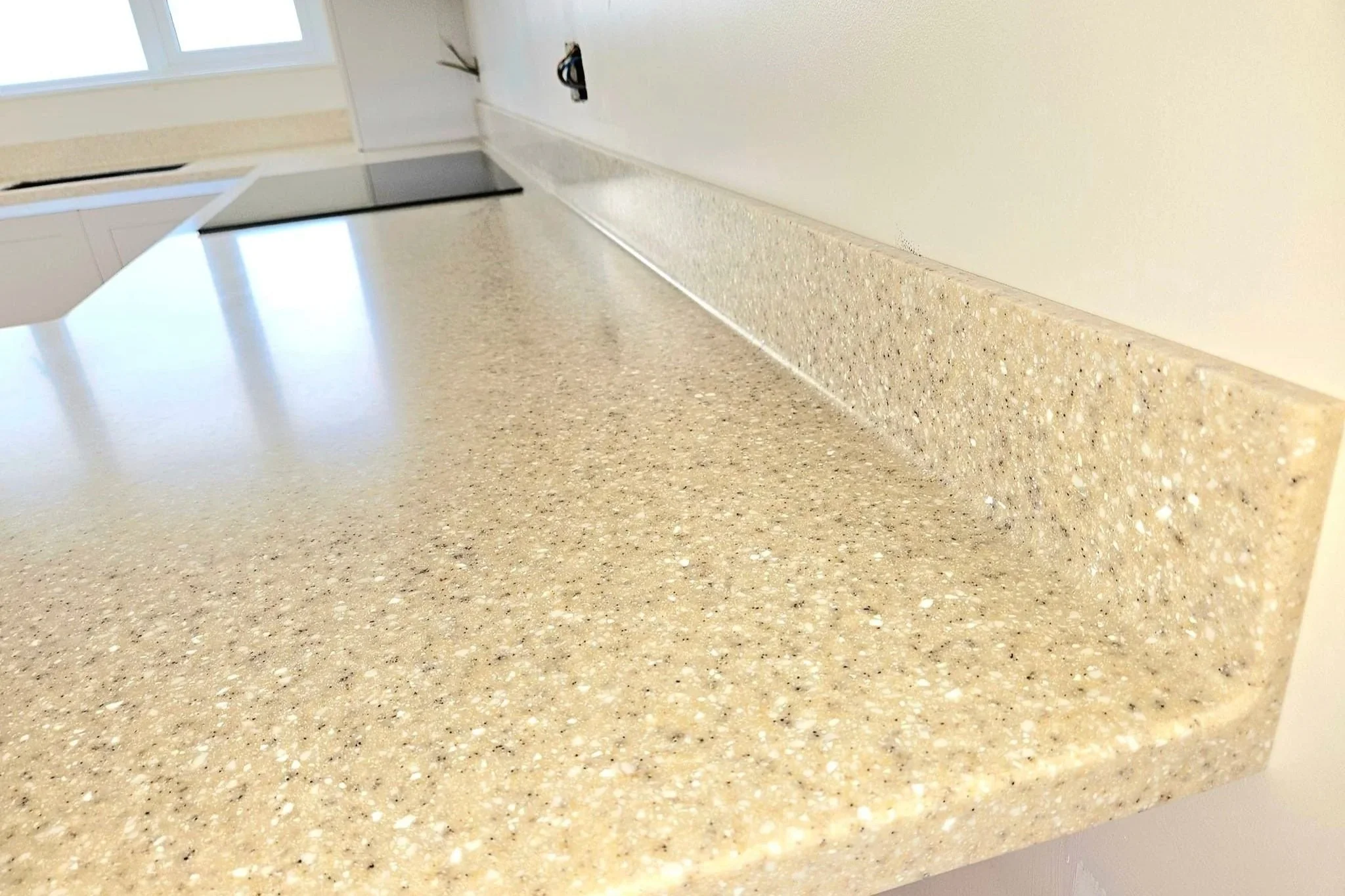
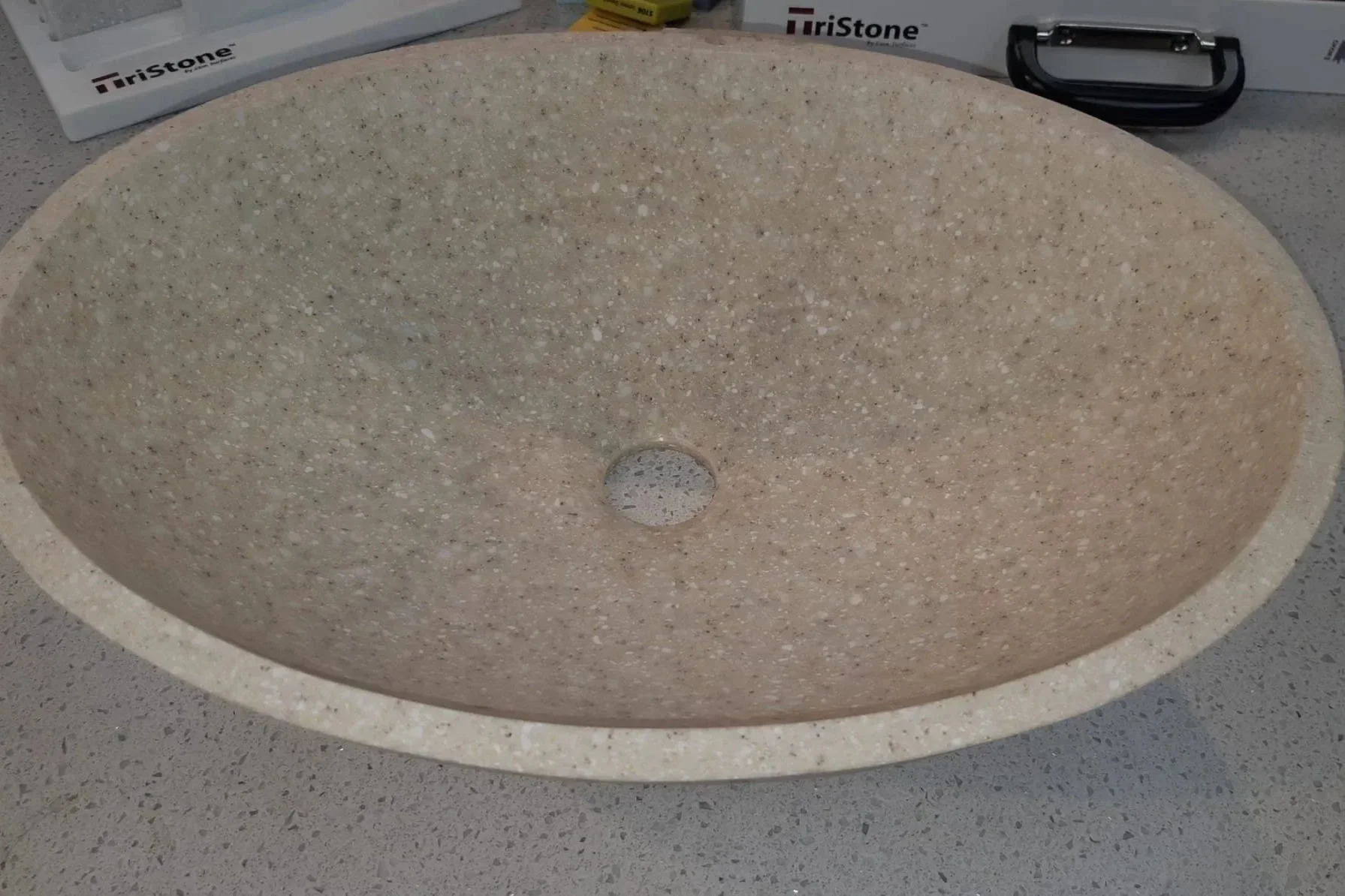
Solid surface materials like Tristone are designed to balance aesthetics with long-term performance. Because the material is homogeneous all the way through, it offers practical advantages that go beyond surface appearance.
Seamless fabrication allows for integrated joints, sinks, and upstands, reducing dirt traps and creating a clean, continuous finish
Non-porous structure means liquids and bacteria can’t penetrate the surface, making it easier to maintain in both domestic and commercial environments
Renewable and repairable finish allows scratches or minor damage to be sanded and restored, rather than replaced